Sunday, December 05, 2010
The Trumbull Continuum
Saturday, December 04, 2010
The Other 80%
Thursday, November 04, 2010
Thinking Aloud About the Mac App Store
With the news that Apple has started accepting submissions for the Mac App Store — and with the announced launch date just a couple of months away — I'm sure I'm not alone in being an indie developer giving serious consideration to whether the store is the right place for me to sell my applications.
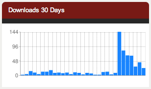
On the surface, this decision should be a no-brainer. The App Store model has succeeded beyond anyone's expectations on iOS, its high-profile nature driving hundreds of thousands of users who would not have otherwise to make purchases. And in case you're in any doubt as to the power of an Apple-managed store front, I present the following:

Can you spot the point where SimCap entered Apple's OS X Downloads list? No, the absolute numbers aren't very impressive, but relatively I'm very happy with the results. And remember that this is a relatively niche developer / marketing tool we're talking about here.
So why would I possibly want to say no to this kind of opportunity, most likely on a much larger scale?
There have already been many posts on these subjects which enumerate the potential drawbacks in a far more depth and with far more eloquence than I can. But from all those potentials, I see the lack of a demos as the biggest stumbling block.
While I'm sure that SimCap would pass Apple's entry requirements (for instance, it doesn't use any private APIs mainly because I wouldn't know where to find these private APIs), there's still something a little
(The chart, by the way, is from Tyler Hall's excellent Shine dashboard. Highly recommended, if you decide to stay out of the Mac App Store.)
Saturday, October 30, 2010
OS X Names Aren't Nearly As Cool As They Used To Be
ifeq "macos" "$(RC_OS)"
    STATIC := $(shell if [ "$(RC_RELEASE)" = "Beaker"    ] || \
        [ "$(RC_RELEASE)" = "Bunsen"    ] || \
        [ "$(RC_RELEASE)" = "Gonzo"     ] || \
        [ "$(RC_RELEASE)" = "Kodiak"    ] || \
        [ "$(RC_RELEASE)" = "Cheetah"   ] || \
        [ "$(RC_RELEASE)" = "Puma"      ] || \
        [ "$(RC_RELEASE)" = "Jaguar"    ] || \
        [ "$(RC_RELEASE)" = "Panther"   ] || \
        [ "$(RC_RELEASE)" = "MuonPrime" ] || \
        [ "$(RC_RELEASE)" = "MuonSeed"  ] || \
        [ "$(RC_RELEASE)" = "SUPanWheat" ]; then \
        echo "-static" ; \
    else if [ "$(RC_RELEASE)" = "Tiger" ]; then \
        echo "-static" \
    else \
        echo "" \
    ; fi; fi; )
else
    STATIC = -static
endif
Lion? I want Mac OS Xs Cookie Monster, Grover and Elmo.
Friday, September 03, 2010
Please Stop Squee-ing Over iOS
Secondly, you can't wait until people jailbreak the new AppleTV and start writing iOS apps for it? Really? Cocoa Touch is a great library - superior in a number of ways to AppKit, which is starting to look a little long in the tooth - but it was written to fit a very particular use case. I'll give you a hint: the clue's in the name. The AppleTV is running on an A4 because the chip is small, cheap and runs cool. I haven't found the figures yet, but I'm going to bet it only just matches the performance of the Pentium M (also clocked at 1GHz) from the original version. Both generations of machines are running a custom UI built on top of Core Animation. And yet we only get the excitement now. I guess the magic word is 'apps', and the world and his dog seem to think they can download XCode, buy a couple of books and strike it rich. Sigh.
Sunday, August 01, 2010
Customising the Appearance of UITabBarController
So you're left with the task of reimplementing UITabBarController, something which originally took a team of Apple developers about three times as long as you've been allocated for the entire project. And you know that you won't even get close, because you'll loose all that useful Apple goodness like
-viewWill(Did)(Dis)Appear messages which actually propagate to sub-view controllers and being able to honour hidesBottomBarWhenPushed from the depths of the navigation stack.What you'd really like to do is just change how the regular UITabBar displayed by UITabBarController looks.
The Warning: I'm using this code in a production project, but I haven't submitted it to the App Store yet. There's a chance that adopting this approach may get your app rejected. (Although chances are that's more likely to happen bceause your new style tab bar looks too much like Apple's own, rather than because of anything happening at the code level.)
This has been tested on 3.1.3 and 4.0.1, but it's exactly the kind of evil hackery which is likely to break with a future iOS upgrade.
The Solution: We're going to create a UITabBarController subclass (yes, even though Apple says not to in the second line of the docs). Here's the code. And here is an example project (based on the default iPhone tab bar template) for the impatient among you).
SJCTabBarController.h:
  #import <uikit/uikit.h>

  @interface SJCTabBarController : UITabBarController {
      UIView *_fakeTabBar;
      UIButton *_currentSelection;
  }

  @property (nonatomic,assign) IBOutlet UIView *fakeTabBar;

  -(IBAction)fakeTabTapped:(id)sender;

  @end
SJCTabBarController.m:
  #import "SJCTabBarController.h"

  @implementation SJCTabBarController

  @synthesize fakeTabBar=_fakeTabBar;

  // evil trickery happens here
  -(UITabBar *)tabBar { return nil; }

  -(void)viewDidLoad {
      [super viewDidLoad];

      // install our fake tab bar
      [[super tabBar] addSubview: _fakeTabBar];

      // set up the default selected tab
      // you may like to read the tab/tag number from the user defaults
      [self fakeTabTapped: [_fakeTabBar viewWithTag: 0]];
  }

  // switch tabs
  -(IBAction)fakeTabTapped:(id)sender {
      // do we need to do anything?
      if(sender == _currentSelection) return;

      // un-select the currently selected button
      _currentSelection.selected = NO;

      // select the new button
      _currentSelection = (UIButton *)sender;
      _currentSelection.selected = YES;
      self.selectedIndex = _currentSelection.tag;

      // you may like to write the selected index into user defaults here
  }

  -(void)viewDidUnload {
      [super viewDidUnload];

      _fakeTabBar = nil;
      _currentSelection = nil;
  }

  @end
Explanations in a second, but first the Interface Builder part of the equation.
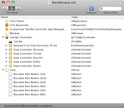
In IB, drag in a UITabBarController (or use the one from the MainWindow.xib created with the default tab bar XCode template) and add view controllers to it. Then change it's class to our UITabBarContoller sub-class. Now add a view to act as your new-look tab bar. This should be a screen wide by the standard 49 points high. Connect it to the fakeTabBar outlet in the subclass. Give it a non-zero tag higher than the number of tabs you want to add.
Now add a button for each tab. Give them a tag which is the same as the index of the view controller you want selected when they're tapped (eg. the first is 0, the second 1, etc.). Wire them up to send
-fakeTabTapped: to the sub-class.You should end up with a hierarchy like this (I've added a total of six view controllers to the tab bar controller in order to demonstrate how awesomely it all works):

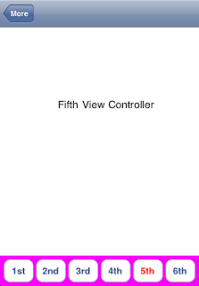
Which will produce something like this (which, by the way, is why no designer working with me needs worry about their job security):

So what's going on in this code? It's really rather simple, and yet I couldn't find anything quite like it on the Googles (which suggests that I've done something incredibly stupid and just not noticed it. I bet you have. The comments are down there). Our custom tab bar is added as a subview of the existing tab bar. We access this via
[super tabBar] because we've overridden the getter for the tabBar property to return nil. We do this to stop Apple's code (which is well behaved and seems to always use the property accessors rather than going straight to the ivar) from altering what it thinks is a standard tab bar. Comment-out this method and you'll see a ghostly "More" tab and various labels appearing.One last fix. You'll notice that when you select a tab which should have been managed by the "More" tab, a navigation bar with a back button entitles "More" will automatically appear at the top of the view. You can remove this by calling
[self.navigationController setNavigationBarHidden: YES];
in the
-viewWillAppear: method of these view controllers. This has the unfortunate side effect of preventing you from using a navigation controller-managed navigation bar in these controllers, but the chances are that if your designer doesn't want to use the standard tab bar, they won't want this behaviour either.(Edit: And immediately after posting this I realised that, in
-fakeTabTapped:, instead of exiting if the same tab was selected again we should be checking for a navigation controller and popping all of its subviews. I'll leave that as an exercise for the reader.)
